Eat The Street Site Redesign
ART 229–Interface Design I
ART 128–Interface Programming I
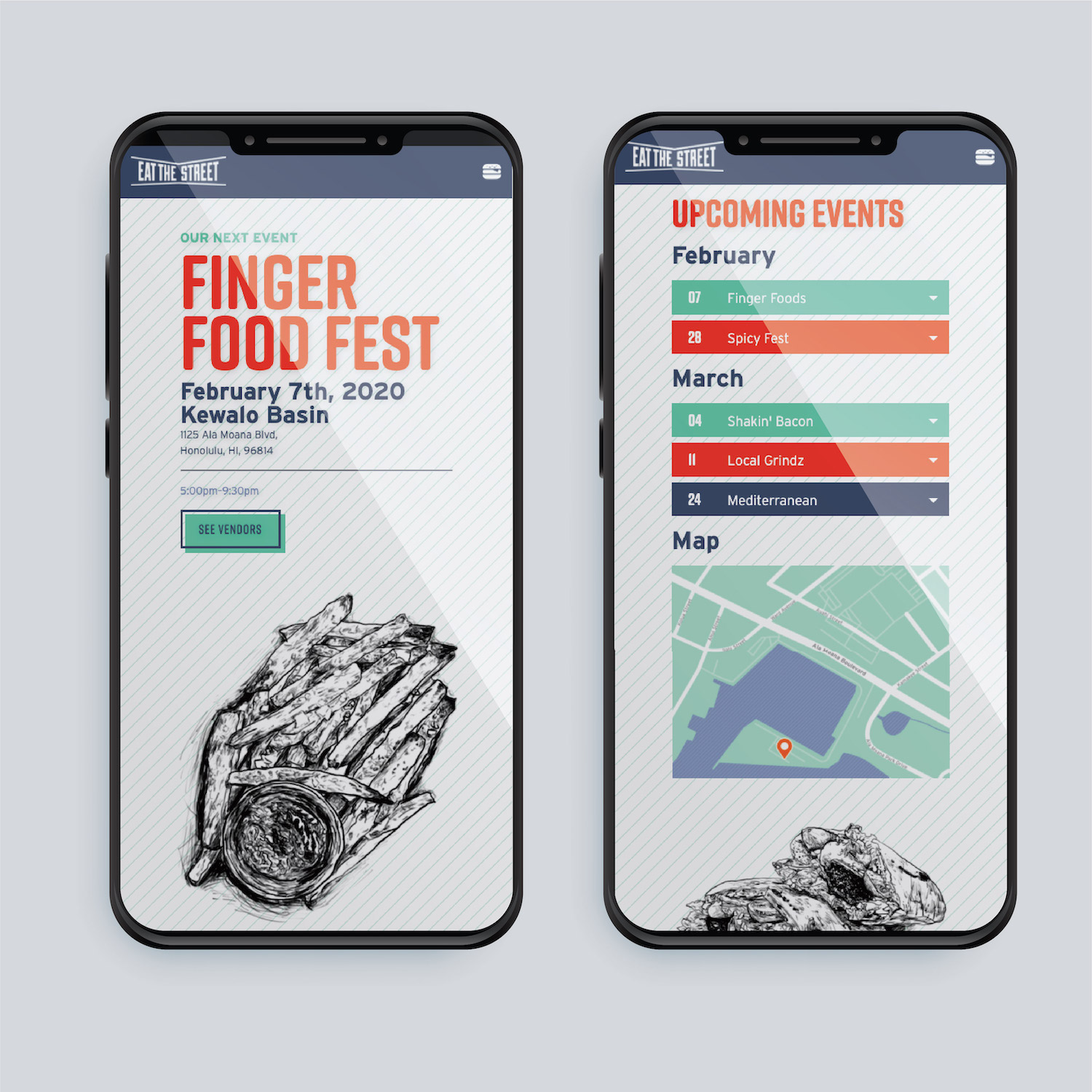
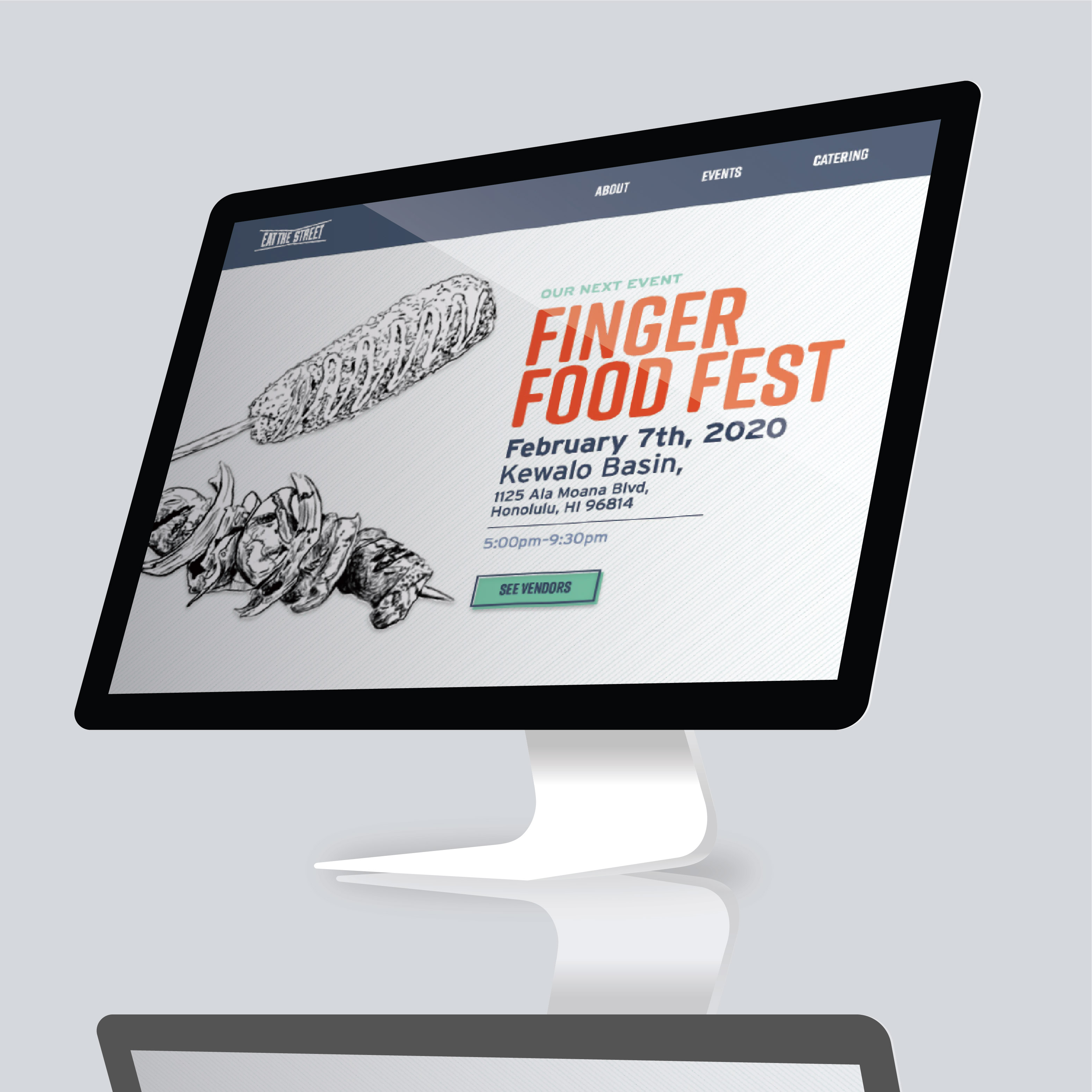
This project started in my Interface Design class and was carried onto my Interface Programming class. I was tasked to create a one-pager-website-design for a subject of my choosing, then create a working responsive website with a basic toggle nav and animated scroll.
CHALLENGE - "Desktop First" Approach
This was my first ever project for the web, so I was unaware of certain challenges that web-design presents versus print-design. My initial design was for a dektop-view because that was the requirement for my class. During coding, I realized my website wouldn't maintain its original design because I designed it from what is called a "Dektop-First" approach. Unlike print, web-design needs to be adaptive to a variety of displays, devices, and sizes which meant I had to flex my design.
SOLUTION - A lot of Media Queries
In my CSS file, I used media queries to control the design of the website based on the size of the browser/display. Combined with the use of special classes such as 'hideonlarge' and 'hideonsmall', I was able to control hierarchy of what a viewer saw, the order the saw it in, and the size of the elements seen. I also controlled the number and width of columns, and a toggle-navigation to appear on smaller screens.
See the live site here.
Service: Logo Design, Branding
Skills: Sketching, Adobe Illustrator


